Platform Improvements: Phase 2 Report
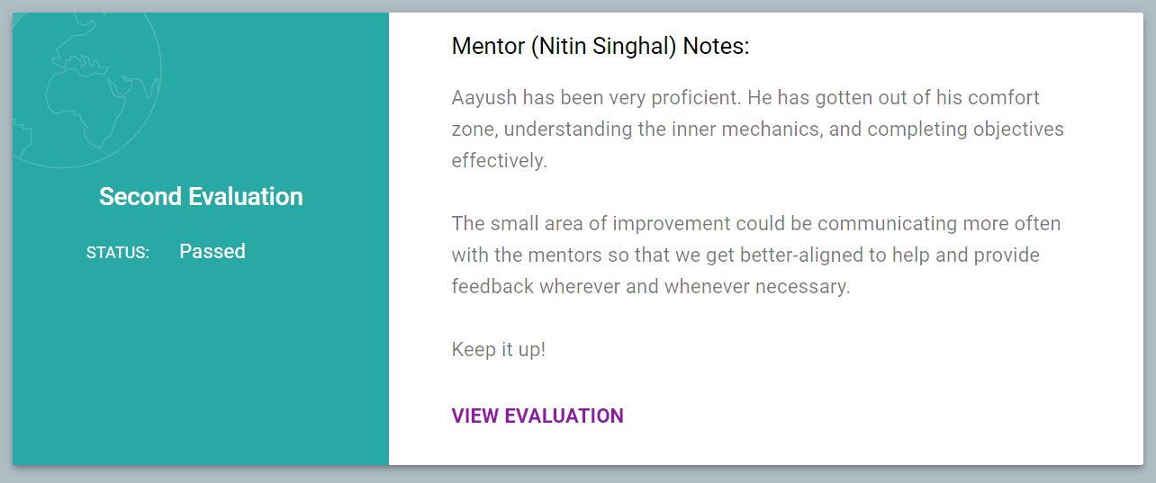
Sailing on the same wave; I cleared my Second Evaluations for Google Summer of Code!
The work done in this phase was a little spreaded over all domains. I started off with finalising the User Interface. Then, along with my mentors get down with merging those PRs. And it was a complete nightmare! With having 10+ files having merge conflicts with each PR getting merged; it took up a huge chunk of time with those tos and fros and the PRs merged.
It’s still under process, but I moved on to complete the rest of items off the checklist to avoid lagging behind.
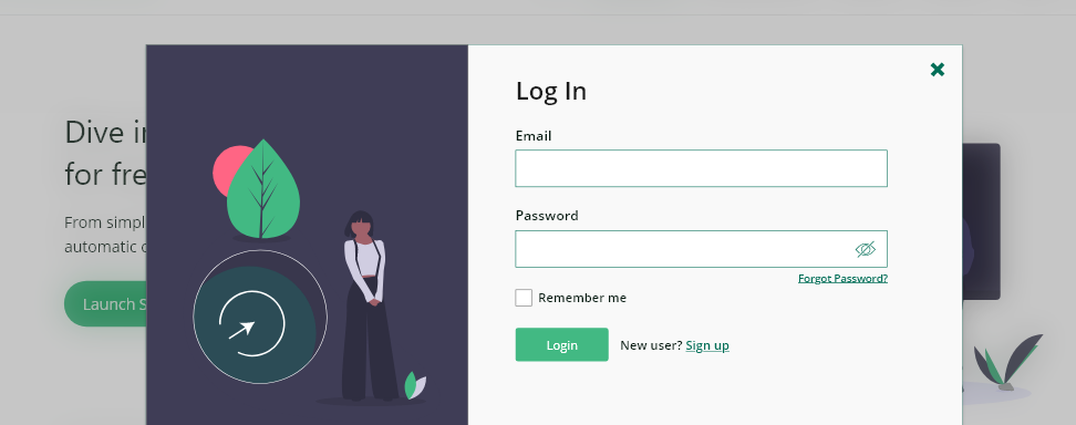
Popup Login system
The login system has to be moved to a Popup based system rather than redirecting the user to a separate page. Popups is a great way to avoid multiple redirects and make the user felt lost between all those different screens in place. This has been made possible by using AJAX form submissions in JSON for devise controllers.

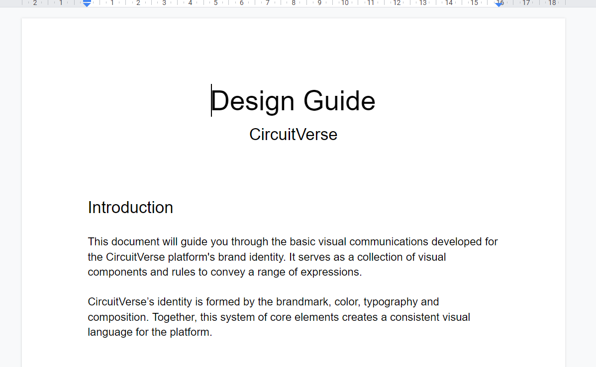
Design Guide
As part of the initial plan, a new Design Guide has to be set up for the CircuitVerse platform which would be used across all its products to maintain a common Visual design and bring unique identity to the products.
It was a completely different experience as I had never put down all the thought process behind designing the User Interface formally on a sheet of paper for future contributors to understand and follow.

Multiple mentors for a Group
Further, I dived into the backend too in this phase implementing the much requested functionality for having multiple mentors in a group. With this in place, now the users would be able to setup more than one mentor for a group. This becomes an essential feature as most university classes move online. With TAs and Support Professors, it is a nice addition so that the Professor and TAs can handle assignments and group members individually from their ends without a lot of tos and fros in between. I got the backend done for it with frontend pending to be completed on the updated master after the backend reviewed and merged.
New Mailer
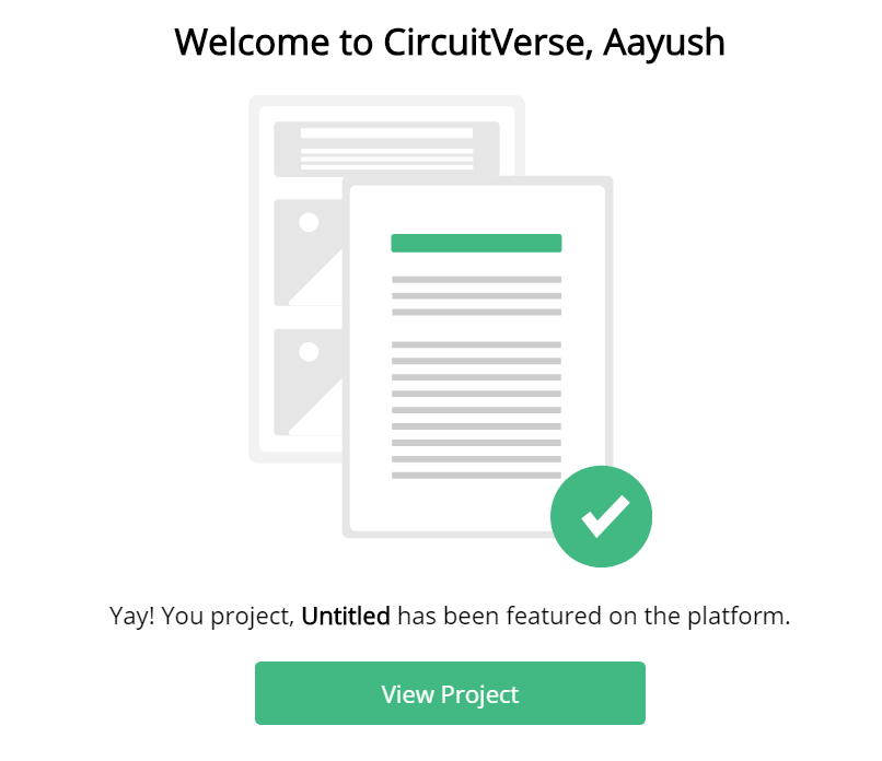
Finally, I moved to work on revamping the Mailer to follow the design language from the platform and be consistent across all mails.
One big problem of having inline styles within the HTML document only, has been taken care by this great gem premailer-rails. This provides support for having Sass stylesheets to keep all your styles and specially media queries at a single place. Then all the styles are preprocessed into inline-styles before the mail gets visible on the screen.
Along with this, I revamped the Custom Mail Admin panel to go in the rest of the platform managing to reduce the code size by around 1/3rd over the use of standard templates.
The Final phase is gonna be a lot more packed with a tons of cleanup to be done. And the GDPR features to be incorporated. Looking forward to finish up this journey with all my Proposal features down to in-production ready to be used by professors and students all over the world.

